Dear Examiner,
I really enjoyed creating adverts for my NEA. You can find all of my NEA posts under the label of 'AS Research and Planning' on the right hand side of my blog.
Thank you for reviewing my blog. I hope you enjoy my finished adverts.
This blog is now closed
My Website

Click to access my website
Wednesday, December 12, 2018
Blog Post 19: My Finished Adverts
These videos are the final edit of my YourFood advert. I enjoyed creating these two adverts and felt that the result was successful at creating the brand and story that I wanted. I think the pace of each advert was fitting for the music and I think that my use of split screen was very effective.
These are my finished adverts:
After looking at my adverts, I believe that they fill the brief successfully. The whole process of creating entire adverts individually was rough at the beginning, as I wasn't confident enough to make my own decisions. There are many shots that I would have liked to be able to improve on, but I think that I still refined my skills and create a really positive outcome for my advert in these couple weeks.
Blog Post 18: My Target Audience Feedback
I did an audience feedback session in order to make sure that my advert appeals to my target audience and to have a final check of whether I stuck to the brief. To do this, I found some people in school during break time who were 16 or 17 to watch my advert and give critical feedback. I had multiple sessions with different people and I recorded all the feedback as notes on a piece of paper.
 On first impressions, everyone who has watched my advert enjoyed it and thought it was very engaging. Many thought that the split screen running shot in advert 2 and the clinking glasses shot in advert 1 were very well done. They thought that the graphics and app were also very professional.
When I asked them whether they would buy from YourFood, all of them said yes. I also asked about what they thought the USP and brand values were, common answers were: wide variety of food, selection of world cuisine, youthful and fast delivery.
 However, many criticised the lighting in my advert, as some shots were filmed poorly, resulting in lighting that cannot be adjusted in post. One particular person also felt like the first advert could have a montage of the boyfriend multitasking many different things when trying to talk to his girlfriend to create a more frantic feel.
From these responses, I have learnt that my advert could still be improved in certain shots with lighting and that I could have emphasised my USPs more. In addition, although people saw regional traits in my advert, no one mentioned it as a brand value. So if I had to redo my advert, I would try to record shots with better lighting and include more outside shots as well as voiceover to anchor that YourFood delivers from local restaurants.

When I asked them whether they would buy from YourFood, all of them said yes. I also asked about what they thought the USP and brand values were, common answers were: wide variety of food, selection of world cuisine, youthful and fast delivery.

From these responses, I have learnt that my advert could still be improved in certain shots with lighting and that I could have emphasised my USPs more. In addition, although people saw regional traits in my advert, no one mentioned it as a brand value. So if I had to redo my advert, I would try to record shots with better lighting and include more outside shots as well as voiceover to anchor that YourFood delivers from local restaurants.
Blog Post 17: My Adverts Review
To create an advert for review, I added music and title cards as well as colour graded and sound mixed my advert. I did all the editing on an Adobe editing software called Premiere Pro and the graphics on Photoshop.
Here are my adverts for review:
From my review, I learnt that my narrative for both adverts were clear and engaging, with many thinking that the split-screens used were to good effect. However, many people said that the first shot in the first advert is too short, and that they weren't able to take it in quickly enough. Another important point was the poor colour grading, with some shots being too bright and some shots being too dark. With this feedback, I was able to perfect my adverts to create a finished product.
Blog Post 16: My Rough Cut
A rough cut was done to get a feeling of the final product and encourage new changes to make my final advert better. I did this by getting rough timings for all my shots and editing it all so it fits 30 seconds with a rough title card.
Here are my two rough cuts:
The rough cuts were very useful, as I realised that the pacing of my adverts were a bit uneven due to the unnatural dialogue. Furthermore, some of the actors were awkward, which caused the narrative and dialogue in both adverts to seem unrealistic. This allowed me to make changes in my backup shoot such as recasting and informing my actors more on what atmosphere I want, which create a more believable and engaging advert.
Blog Post 15: My Shootboard
A shootboard was a key component to shooting my advert as it allowed me to structure which order I wanted to shoot my shots so that it would be convenient for me and my actors. I created my shootboard on a word document with:
- Day and time
- Shot number
- Specific location
- Action and dialogue
- Camera framing and movement
- Actors and props
- Crew roles
- No. of takes
- Best take
Below are extracts from my shootboard:


 Creating a shootboard helped massively when I was recording my advert as I organised everything beforehand, which reduced the stress on the day. In addition, the shootboard also plans out any dialogue, framing, movement, props and actors required for each shot, allowing me to group shots together depending on whatever is most convenient. When I was editing, it also helped me find out which shot was the best take, allowing me to quickly assemble a rough cut for review.


Blog Post 14: My Kit List
To use the camera equipment, Simon and I had to sign a kit release document to ensure that we took good care of the camera equipment and that we received the proper training required to operate our equipment. This also made sure that each person takes equal responsibility over the equipment and stuck to any plans made before the weekend. The kit list was useful to check off that everything was packed together and that we didn't forget anything. The equipment contract ensures that I take my responsibility in caring for the camera and acting professional when using it. It also asks for my parent's signature so I have permission to film during the shoot weekend.
Below are the equipment release document, the equipment contract and the kit checklist:


 The kit release process was very important as we were handling with very expensive equipment and we needed to provide contact details in case anything went wrong. It was also reassuring to know that the kit will always be complete, functional and in good condition. This meant that we could focus on other things during the shoot days instead of worrying about kit.
Below are the equipment release document, the equipment contract and the kit checklist:


Blog Post 13: My Time-Plan, Crew And Cast List
A time-plan and cast list is vital to making sure that the recording day goes as planned. They are useful for informing everyone on what time to come and gives a structure to the day so I can get all the shots required. Furthermore, many of my shots needed to be shot when the sky was dark, meaning that my partner could shoot all of his shots first before I started shooting mine.
Below is my time plan, crew and cast list:
Although I didn't follow my timeplan very strictly, it did help me organise my weekend so that we gave enough time for each person to get all their shots. The cast list was important as I had to confirm that all my cast were able to make it on the day. I also contacted more people to keep the recording day free in case a cast member was not able to make it and I needed backup.
Blog Post 12: My Location Reccie, Risk Assessment And Location Permissions
A location reccie, risk assessment and location permissions are all important to make sure that the chosen location is safe, legal to film and ideal for my advert. I did this by taking photos at all my locations for the reccie and asking shop owners and parents for permission to film on their property.
Below is proof of my location reccie, risk assessment and location permissions:
This planning was done to make sure that the location was available and safe to film on the day of recording. I also visited different locations to find the best place to film my advert,
Below is proof of my location reccie, risk assessment and location permissions:
This planning was done to make sure that the location was available and safe to film on the day of recording. I also visited different locations to find the best place to film my advert,
Blog Post 11: My Practice Shoot/Edit
I did a practice shoot to check the practicality of my advert. To record the practice shoot, I used my phone camera. Then I put all the footage on Premiere Pro to do a practice edit.
Here are my two test shoots:
Doing a test shoot and edit was extremely beneficial to my project as it showed me areas that I should improve, such as the fact that the narrative wasn't really clear. To solve this, I decided to change my advert so that it ends with the couple celebrating their anniversary together. I also changed the action sequence in the second advert to a 4 way split screen as it was more creative and innovative. In addition, I didn't plan out my day properly for the test shoot, resulting in rushed shots and shots taken at the wrong time or place. Therefore, I was able to plan more efficiently so I wouldn't make the same mistake for the actual advert.
Blog Post 10: My Advert Storyboards
I created a storyboard as it is important for any project to present my vision of what I want to make on paper. This makes sure that my idea is practical and allows me to look at my advert as a whole to make it interesting. To make my storyboard, I used colour code Post-it notes to draw the shots and move them around if needed. The colours represents which type of framing I used in each shot and more Post-its are put behind to note down any sound that accompany the shot.
Here are my storyboards:


Here are my storyboards:


From doing a storyboard, I was able to realise that I could rearrange my shots to create a better narrative flow. Also, the storyboard was used as reference during editing to get the framing and order of the shots correct. It helped me to set it out on paper so it was less likely for me to leave something out or forget something by mistake.
Blog Post 9: My Advert Timelines
Creating a timeline is very important to creating a successful advert because it allowed me to get rough timings for each shot and made sure that my adverts were 30 seconds to fit the brief.
Here are my two timelines:


When I did my timeline, I was able to find out how I would time my dialogue and my voiceover. I also made sure that my narrative was able to fit within the 30 seconds. I was also able to use my timeline as reference during editing to make sure the pace of the advert matches what I wanted initially.
Blog Post 8: My Initial Proposal
I did an initial proposal to create a foundation for my advert and open the narrative to criticism. I was then able to adapt my initial proposal to make sure I fit the brief and also to make it memorable.
 When creating my initial ideas, I compiled many pictures to make a moodboard. This included many pictures of food, settings and a food map from an event organiser called Concerto. The theme I was going for is a world cuisine style, as my USP is being able to order from different world cuisine restaurants at the same time.

My initial idea for my first advert was an anniversary dinner where the husband hasn't cooked anything, so he orders from YourFood on his phone under the table. The wife hears the doorbell when the food arrives, becoming angry when she realises that her husband didn't actually cook any food. However, when she sees the YourFood logo on the bags, she is filled with delight. The husband then goes to get wine and when he comes back, the wife has already eaten all the food. It ends like this because the brief requires the use of techniques to make the adverts memorable, which I did by using humour. The music in this advert will start off very fast and frantic, but slow down to a romantic classical piece to connote that the situation is resolved. This advert was inspired by the HelloFresh Challenge Accepted advert as it presents a chaotic situation that is solved by the HelloFresh, similar to how YourFood will solve the disastrous date night in my advert.
 My second idea was a group of teenagers having a movie night and wanting to order food, creating a youthful, relatable situation for my target audience. So the group decides to order food from different restaurants using the YourFood app. Then, it cuts to an action sequence of the delivery person collecting the food and running, with an intense soundtrack to accompany it. I planned to have an intertextual reference to the editing style in 'Shaun of the Dead' for the collection and a sequence in the style of the running scenes in "The Flash", which has lightning effects and slow-motion. The running sequence allows me to show the fast delivery time, but to also connote the regional brand identity stated in the brief as the food is local and ready to be delivered. The advert ends on the group of friends having a great time eating together in front of the TV. This advert was inspired by the Just Eat Balti Rocks advert as it has a similar setup of people pondering on what food to get, leading into a overly dramatic sequence.
I planned an initial proposal because it allows my ideas to be influenced by the criticism I received. I learnt that I should:
After making these changes, I was able to correct any major flaws in my adverts and made sure that they stuck to the brief.
 When creating my initial ideas, I compiled many pictures to make a moodboard. This included many pictures of food, settings and a food map from an event organiser called Concerto. The theme I was going for is a world cuisine style, as my USP is being able to order from different world cuisine restaurants at the same time.
Below are my proposals for my two adverts:


 My second idea was a group of teenagers having a movie night and wanting to order food, creating a youthful, relatable situation for my target audience. So the group decides to order food from different restaurants using the YourFood app. Then, it cuts to an action sequence of the delivery person collecting the food and running, with an intense soundtrack to accompany it. I planned to have an intertextual reference to the editing style in 'Shaun of the Dead' for the collection and a sequence in the style of the running scenes in "The Flash", which has lightning effects and slow-motion. The running sequence allows me to show the fast delivery time, but to also connote the regional brand identity stated in the brief as the food is local and ready to be delivered. The advert ends on the group of friends having a great time eating together in front of the TV. This advert was inspired by the Just Eat Balti Rocks advert as it has a similar setup of people pondering on what food to get, leading into a overly dramatic sequence.
Both my adverts will be 30 seconds long and will have innovative appeal that is suitable for the prime-time Channel 4. The date night advert will be skewed towards the typical female audience through the use of romance and the movie night advert will be skewed towards the typical male audience through the use of action. However, in both adverts I aim to have the mass appeal to my target audience that is required by the brief. This is done through the relatable or aspirational situations to the 16-25 year old audience in both of my adverts and the ethnically diverse characters that I will use. The brief also requires the same on screen text in both adverts, so they will both have the use of the YourFood app and end with the same title card and voiceover, which says "Eat the world with YourFood". The app and the title card will have the same logo, tagline and same colour scheme, which creates consistent branding and enforces my USP of being able to order many different world cuisines at once.
- change the characters in first advert to boyfriend and girlfriend to create consistent youthful branding
- have the boyfriend start in the kitchen to connote the dilemma he is in through the messy kitchen
- remove special effects from running sequence as it was an unrealistic goal to achieve
- remove the feature allowing orders from multiple restaurants as it was impractical for actual delivery services to offer
- change the logo as the imagery of the Earth could be misleading when first looked at
After making these changes, I was able to correct any major flaws in my adverts and made sure that they stuck to the brief.
Blog Post 7: Research Into Existing TV Commercials In Other Forms (eg. Online, Print, Billboard)
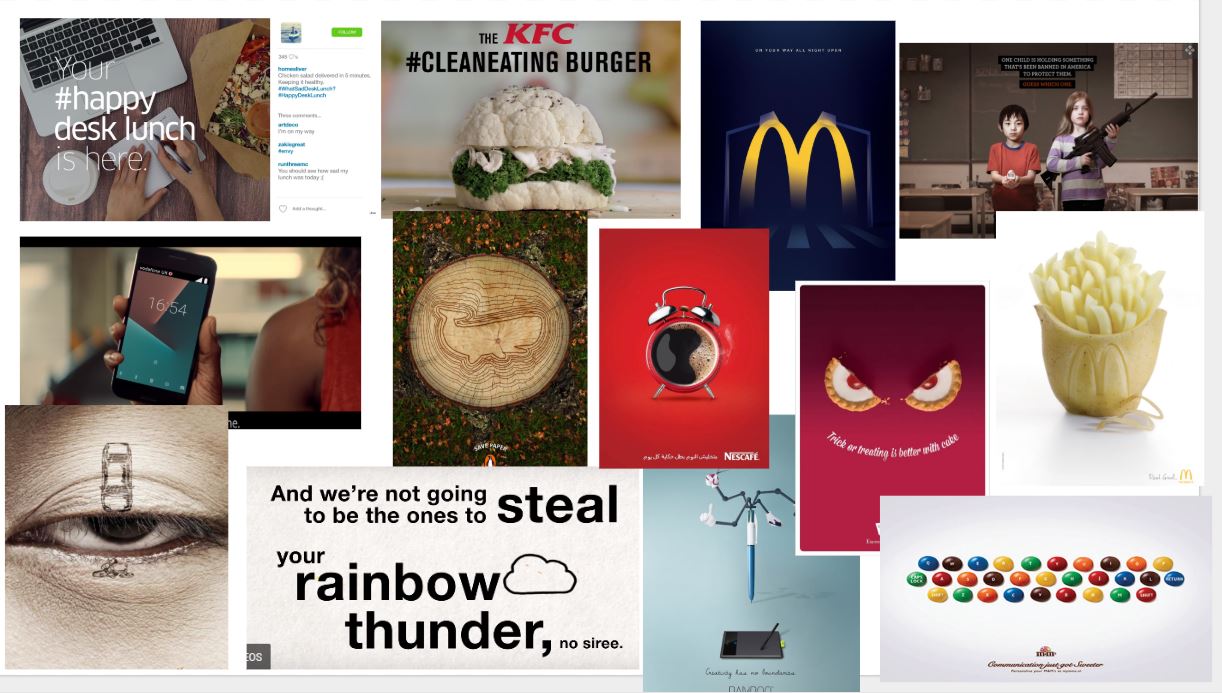
To fully understand a brands marketing campaign, I decided to research into other forms of commercials such as online or billboard adverts. I was able to take inspiration from the adverts I liked and understand the synergy between these adverts and moving adverts seen on TV. I found these adverts initially by looking at a print advert list from Creative Bloq and then researching into more depth by analysing other adverts from the same campaign.

One advert I looked at was a the Nescafé advert which portrays an alarm clock as a cup of coffee. This connotes the effectiveness of their product at doing the same thing as an alarm: waking people up. The focal image of the coffee is placed in the centre, drawing the audience's focus onto it. Furthermore, Nescafé keeps a consistent red colour scheme, which represents their brand. The red connotes a luxury or high class commodity, giving the product a premium feel. I feel like this advert is bold and punchy, proving that adverts can still deliver message through a single frame by using simple imagery.


 |
| Moodboard of print adverts I liked |
 |
| Moodboard of print adverts I liked |
Blog Post 6: Research Into Existing TV Commercials (Other Genres)
I researched into other genres of TV commercials to understand the conventions of other genres of ads which could potentially be used in genre hybridity. It also allows me to take inspiration from the innovative advert ideas and the techniques used to anchor and reinforce a message or a brand value.
Common conventions that I found across all the adverts I researched were:
Below is my advert playlist, which has all the different 'non-food delivery' adverts that I looked at
On the other hand, Cadbury Roses Thank You advert uses a more heartwarming, emotional appeal to send its message across. The narrative doesn't make sense until the end, but it instantly evokes the emotion of empathy when the audience realises that the boy was being polite to everyone who did something for him. Furthermore, the phrase "Roses" is repeated multiple times within the advert, which emphasises the brand values of spreading love. The title card at the end also had the slogan "Another way to say thank you", which anchors the narrative and suggests that their product is the best way of showing kindness or gratitude. In the advert, most of it only used diegetic sound, which made the whole advert seem more realistic and personal. There is no representation of non-white ethnicities but has a positive representations of lower socio-economic classes, as the child was presented as grateful and polite.
An advert that I also looked at was the KFC South Africa Streetwise 2 advert which utilises slapstick and physical humour from when football players fall over and fake injuries. This appeals to males and subverts expectations massively, as it was so hyperbolic that it creates humour. An example of this is when the footballer stops at the traffic lights, but then continues rolling after the light has turned green. Furthermore, the fake injuries could be an intertextual reference to similar occurrences seen on live football.
 Furthermore, I looked at the use of genre hybridity in the Chicago Town advert, which uses explosions, a deep-voiced narrator and slow-motion to refer to blockbuster action movies, which typically appeals to males. Overall, the genre hybridity created a memorable advert which allowed the product to reach out to action movie fans and the typical male audience.
Researching into other genres of TV commercials proved to be useful to me as I learnt that making my advert memorable could be done through different ways, e.g humour, emotional appeal, intertextuality and genre hybridity. Furthermore, the adverts I looked at indicates the importance of having a good narrative for the audience to link the brand to, so I will spend more time on my narrative to make it more engaging and innovative.
Common conventions that I found across all the adverts I researched were:
- use or promo image of the product in the advert
- logo
- tagline
- website
- variety of camera shots and editing techniques
Adverts also tend to have one strong message that is prominent throughout the entire advert. Emotional adverts have more diegetic noise, seen in the Cadbury Mum's Birthday Advert and Ariel #ShareTheLoad advert. On the other hand, more humourous adverts make use of upbeat music to add more to the comedic effect, for example, the KFC South Africa Streetwise 2 advert and the HelloFresh Challenge Accepted advert.
Below is my advert playlist, which has all the different 'non-food delivery' adverts that I looked at
On the other hand, Cadbury Roses Thank You advert uses a more heartwarming, emotional appeal to send its message across. The narrative doesn't make sense until the end, but it instantly evokes the emotion of empathy when the audience realises that the boy was being polite to everyone who did something for him. Furthermore, the phrase "Roses" is repeated multiple times within the advert, which emphasises the brand values of spreading love. The title card at the end also had the slogan "Another way to say thank you", which anchors the narrative and suggests that their product is the best way of showing kindness or gratitude. In the advert, most of it only used diegetic sound, which made the whole advert seem more realistic and personal. There is no representation of non-white ethnicities but has a positive representations of lower socio-economic classes, as the child was presented as grateful and polite.
 |
| Source: South Africa KFC Streetwise 2 Advert |

Researching into other genres of TV commercials proved to be useful to me as I learnt that making my advert memorable could be done through different ways, e.g humour, emotional appeal, intertextuality and genre hybridity. Furthermore, the adverts I looked at indicates the importance of having a good narrative for the audience to link the brand to, so I will spend more time on my narrative to make it more engaging and innovative.
Blog Post 5: Research Into Existing TV Commercials For Takeaway Food Delivery Services
Researching into existing takeaway food delivery TV commercials allowed me to understand common conventions within this type of promotion and lets me look at how brands communicate their message and brand values across to their audience. I did this by analysing at 10 adverts briefly, and then going into micro analysis on 4 adverts with the help of using a table.
 The general conventions for food delivery adverts are:
I decided to look at the Just Eat Magic is Real advert. The advert starts in a living room, but also has a Chinese takeaway and a street with many other takeaways, which indicate that it is a food delivery company. The advert also features a song repeating the phrase "magic is real".
This phrase and the lyric "just eat exactly what you feel" suggests that Just Eat's brand values are fast delivery and a wide range of food as the delivery process feels like 'magic, being able to deliver whatever you feel like in a couple taps.
Furthermore, the advert uses a range of framing and editing techniques, especially in the main street shot shown on the left. This shot has a zoom out ELS to capture the grand sense of community that Just Eat brings, which is anchored by editing the shot to the climax of the song. This shot is sung in the style of a musical similar to the synchronised ELS seen in the opening sequence in 'La La Land', which is an example of intertextuality.
The representation is diverse with white, black and Asian people all featured, many with different occupations. The joyous group singing gave everyone in the advert a positive representation, as everyone seemed to be part of the same community, all contributing to one cause. However, the delivery driver was conformed to the stereotype of being a male driver, which many of my adverts that I looked at also had.
The advert has a simple graphic at the end with the on screen text "Download the app or order online now" and the Just Eat logo. This uses direct address towards the viewer, making them feel compelled to order as the process of eating from Just Eat is presented to be as simple as downloading an app. The Just Eat logo creates consistent branding and links all their brand values in the advert to the brand itself, which increases memorability as it is the last thing seen in the advert.
Below is the Just Eat advert I analysed and the playlist of all the other adverts I looked at as well
The mains points that influenced my advert are making sure to have the conventions of a food delivery advert. This way I can have strong anchorage between all the conventions to create the brand image I want, which is being able to order high quality world cuisine easily. Furthermore, I learnt that it is important for me to represent the diverse community of London within my advert as well as including female delivery drivers to break the stereotype.
 The general conventions for food delivery adverts are:
 |
| An example of the delivery driver and the branding on the motorcycle |
- logo
- brand name
- website
- slogan
- delivery driver
- use of the app/website
- voiceover
- home and street setting
However, for adverts to be memorable and impactful, many adverts also include at least one of the following:
- Humour
- Emotional appeal
- Intertextuality
- Genre hybridity
I decided to look at the Just Eat Magic is Real advert. The advert starts in a living room, but also has a Chinese takeaway and a street with many other takeaways, which indicate that it is a food delivery company. The advert also features a song repeating the phrase "magic is real".
This phrase and the lyric "just eat exactly what you feel" suggests that Just Eat's brand values are fast delivery and a wide range of food as the delivery process feels like 'magic, being able to deliver whatever you feel like in a couple taps.
 |
| Everyone dancing together in a Just Eat advert |
 |
| The opening sequence to the film 'La La Land' |
The representation is diverse with white, black and Asian people all featured, many with different occupations. The joyous group singing gave everyone in the advert a positive representation, as everyone seemed to be part of the same community, all contributing to one cause. However, the delivery driver was conformed to the stereotype of being a male driver, which many of my adverts that I looked at also had.
The advert has a simple graphic at the end with the on screen text "Download the app or order online now" and the Just Eat logo. This uses direct address towards the viewer, making them feel compelled to order as the process of eating from Just Eat is presented to be as simple as downloading an app. The Just Eat logo creates consistent branding and links all their brand values in the advert to the brand itself, which increases memorability as it is the last thing seen in the advert.
The mains points that influenced my advert are making sure to have the conventions of a food delivery advert. This way I can have strong anchorage between all the conventions to create the brand image I want, which is being able to order high quality world cuisine easily. Furthermore, I learnt that it is important for me to represent the diverse community of London within my advert as well as including female delivery drivers to break the stereotype.
Blog Post 4: The Target Audience (Males And Females Aged 16-25)
Researching the target audience of males and females aged 16-25 was very important to me as it was part of my brief and I needed to be able to appeal to them. It also allowed me to learn about the overlap of target audience for programmes on Channel 4 and informed me in great detail about what our target audience values in a takeaway delivery service. I collected all my research from research reports and primary research sources.
Channel 4 did research on many young people to discover that it is possible to split up these people into 5 big macro segments:
Each of these sections can be split down into 'tribes', which further breaks down each segment into different personalities. For my research, I decided to focus on the mainstream segment, because my advert portrays YourFood as a popular 'mainstream' brand.
The mainstream sector includes chavers, fan girls, sports junkies who:
I also helped create a survey conducted as a group which I posted on the internet and spread it around to people I know. It received a total of 41 responses from people that fit in my 16-25 year old target audience. From this survey, I found out that the most popular choice of food on food delivery apps is Chinese and pizza, so I plan on having those two foods in my advert. It also provided me with detailed information about my target audience's lifestyle, TV viewing preferences and opinions revolving around food and food delivery services.
I found out that most of my respondents' lifestyles are related to at least one of the following:
This suggests a busy lifestyle, so my brand must appear to be easy and quick for them to use in order to save them time.
Furthermore, I asked them about which aspects they thought were most important to creating a successful food delivery brand. I asked them about 17 different aspects but the most important were the 6 aspects above. With the most important to the least important being:
Here is my survey, which shows all the other questions I asked:
From all my research, I now understand that my brand should be seen as a popular choice for food in social situations in order to appeal to the mainstream sector. However, I will also need to show innovation to appeal to other sectors to make sure I have maximum reach. Furthermore, my research has told me that I should make my app seem quick and easy to use, as well as to set quality of food, good hygiene rating and speed of services as the main USPs of my brand.
 |
| Source: UK Tribes Website |
- Mainstream
- Aspirant
- Alt
- Urban
- Leading edge
Each of these sections can be split down into 'tribes', which further breaks down each segment into different personalities. For my research, I decided to focus on the mainstream segment, because my advert portrays YourFood as a popular 'mainstream' brand.
The mainstream sector includes chavers, fan girls, sports junkies who:
- tend to stick with the trend, chart music, prime time TV, local nights and drinks
- have little desire to hunt down niche fashion and music
- are loyal to their friends
- follow the siege mentality of their surrounding peers
I found out that most of my respondents' lifestyles are related to at least one of the following:
- exercising
- socialising
- spending time in front of screens
- personal hobbies
- working at their job
This suggests a busy lifestyle, so my brand must appear to be easy and quick for them to use in order to save them time.
 |
| This is research on which aspect of a food delivery services people think in the most important |
- Quality of food
- Good hygiene rating
- Speed of services
- Range in restaurants
- Temperature of food
- Range in dishes
Here is my survey, which shows all the other questions I asked:
From all my research, I now understand that my brand should be seen as a popular choice for food in social situations in order to appeal to the mainstream sector. However, I will also need to show innovation to appeal to other sectors to make sure I have maximum reach. Furthermore, my research has told me that I should make my app seem quick and easy to use, as well as to set quality of food, good hygiene rating and speed of services as the main USPs of my brand.
Blog Post 3: The ASA BCAP Code
Understanding the ASA's BCAP code was very important for me, so that I could make sure that my advert follows the guidelines to broadcast on live TV. I decided to go through main headers on the BCAP code from the ASA website and pick out the most important and relevant points.
The BCAP code is an advertising code with 32 sections that applies to all advertisements and programme sponsorship credits on radio and television services licensed by Ofcom.
From my research, I found out that ASA has many rules in their BCAP code which regulate TV adverts but the most relevant points for my advert are that it:
This reserach is relevant to me because there are many compliance rules that apply to all adverts such as no serious offence or harm. Some of these rules also apply to my genre, for example, to not condone or encourage poor nutritional diet or an unhealthy lifestyle.
Important information that I have learnt from my research is that I should make sure to use seat belts and helmets if using transport, since takeaway delivery ads may include the delivering process of the food around the city, however I will avoid this by having my delivery person run instead. Another key point is that I shouldn't condone poor diets, e.g only eating pizza. This means that I need to add variety to my brand and make sure that I anchor the idea of healthy eating within my brand. However, the other points I researched must not be forgotten when creating my advert, because I don't want to fail the brief by breaking the code.
The BCAP code is an advertising code with 32 sections that applies to all advertisements and programme sponsorship credits on radio and television services licensed by Ofcom.
From my research, I found out that ASA has many rules in their BCAP code which regulate TV adverts but the most relevant points for my advert are that it:
- must be easily recognised as an advert
- must not have misleading marketing, but are allowed obvious exaggerations
- must not have serious offence or harm
- must not have epileptic material or excessively noisy adverts
- must not condone or encourage easily reproducible dangerous behaviour
- must not refer or feature people without their permission, unless in brief, incidental appearances
- must not condone or encourage poor nutritional diet or an unhealthy lifestyle
- must not feature, imply or encourage irresponsible or immoderate drinking
- must have societal responsibility to promote safe use of transport, e.g. using a seat belt
This reserach is relevant to me because there are many compliance rules that apply to all adverts such as no serious offence or harm. Some of these rules also apply to my genre, for example, to not condone or encourage poor nutritional diet or an unhealthy lifestyle.
Important information that I have learnt from my research is that I should make sure to use seat belts and helmets if using transport, since takeaway delivery ads may include the delivering process of the food around the city, however I will avoid this by having my delivery person run instead. Another key point is that I shouldn't condone poor diets, e.g only eating pizza. This means that I need to add variety to my brand and make sure that I anchor the idea of healthy eating within my brand. However, the other points I researched must not be forgotten when creating my advert, because I don't want to fail the brief by breaking the code.
Blog Post 2: Channel 4
Researching Channel 4 was important because it helped me to understand how Channel 4 was created and the brand values that I have to fulfil. In addition, I was able to look into Channel 4's programmes and schedules to find out where I can place my importance and learn about the importance of ratings. I did this by looking at research reports from Ofcom and BARB, checking the wikipedia for Channel 4, looking at Channel 4's 2017 annual report and reading the book Public Service Broadcasting in the Age of Globalization.
From my research, I was able to find out that the channel was founded in 1982, and is owned by Channel Four Television Coorporation. It is a public service broadcaster, meaning that Channel 4 has to fulfil the demands of the public service remit, which is regulated by Ofcom.
There are many guidelines that the remit states, but the most important ones are as the following:
This research proved to be particularly vital to my project as I could place my advert around popular youth programmes like Hollyoaks. In addition, knowing Channel 4's brand values helped me make sure to present diversity and fit the alternative theme with my advert
 |
| Source: Channel 4 website |
There are many guidelines that the remit states, but the most important ones are as the following:
- The form or content of programmes should show innovation, experimentation and creativity
- It should have appeal to the tastes and interests of a culturally diverse society
- It should exhibit a distinctive character
- It should provide a substantial amount of educational content
On top of this, Ofcom's Channel 4 report indicates that Channel 4 also performs well in promoting alternative view and new perspectves as well as all the aspects in the remit.
 |
| Source: Channel 4 Annual Report 2017 |
The Channel 4 annual report mentioned how 64% of their investment goes to innovative British programmes and how they have a strong relationship with young people which is more than 8% stronger than other PSBs. This indicates the importance of showing innnovation and a connection with young people in my advert.
I found out that some of the popular Channel 4 shows are: The Great British Bakeoff, Hollyoaks, Celebrity Hunted and Gogglebox. The Great British Bakeoff also had the 6th most viewed episode on 31st October 2017 with 10.04 million viewers. From researching Channel 4's shows, I discovered that Hollyoaks has the same target audience as me and is always airing during the 6:30-7:00pm, so airing my advert at around 7:00pm is the best option for me.
| Source: Channel 4 Website |
This research proved to be particularly vital to my project as I could place my advert around popular youth programmes like Hollyoaks. In addition, knowing Channel 4's brand values helped me make sure to present diversity and fit the alternative theme with my advert
Blog Post 1: Existing Takeaway Food Delivery Services/Industry
I researched existing takeaway food delivery services and the industry to understand the competitors in the market, how they become successful and how the industry works. This also allows me to look at USPs of companies and spot any gaps in the market to advertise in my advert. I did my research by recording relevant points about the values, history and USPs of different brands as well as looking into how the service operates in the industry.
The key things I found out about the industry was that the total spending on takeaway rose up to £9.9b in 2016 and that customers on average spend £30 a month on takeaway, stated by Just Eat's British Takeaway Campaign. This indicates that the industry plays an important role in many people's lives and that food companies are growing exponentially.

According to the Business Matters magazine, the three biggest competitors in the food delivery market are Deliveroo, Just Eat and Uber Eats. These three companies dominate the market, so I did research for each one, but the research for Uber Eats was the most important as they had a brand that was similar to the one I envisioned.
Uber Eats was launched in 2014 and is now located in over 250 cities. The Uber Eats USP focuses mainly on having high quality and a large variety of food, with more than 50 different types of food to choose from on their app. Furthermore, from using their app and website, I have found that it was easy to use and quick to order. With only a few taps, I was able to pick the type of food, the restaurant, menu item and how I will pay. Afterwards, tracking is provided to keep the customer updated on how close the food is to being delivered.
This research contributed to my final advert because I learnt about the several big brands which dominate the industry, which could potentially create a gap for nicher brands in the market. I also understand that high quality food and a wide variety of food are important brand values which I have implemented into my brand values for YourFood.
The key things I found out about the industry was that the total spending on takeaway rose up to £9.9b in 2016 and that customers on average spend £30 a month on takeaway, stated by Just Eat's British Takeaway Campaign. This indicates that the industry plays an important role in many people's lives and that food companies are growing exponentially.

 |
| Example of Uber Eats Branding on their website |
Uber Eats was launched in 2014 and is now located in over 250 cities. The Uber Eats USP focuses mainly on having high quality and a large variety of food, with more than 50 different types of food to choose from on their app. Furthermore, from using their app and website, I have found that it was easy to use and quick to order. With only a few taps, I was able to pick the type of food, the restaurant, menu item and how I will pay. Afterwards, tracking is provided to keep the customer updated on how close the food is to being delivered.
 |
| Deliveroo Research |
 |
| Uber Eats Research |
 |
| Just Eat Research |
This research contributed to my final advert because I learnt about the several big brands which dominate the industry, which could potentially create a gap for nicher brands in the market. I also understand that high quality food and a wide variety of food are important brand values which I have implemented into my brand values for YourFood.
Wednesday, October 10, 2018
The Big Issue Cover Evaluation

What went well - I think that I encapsulated the general idea of what a Big Issue cover looks like through the use of common conventions seen on the covers. Furthermore, all the text is clear and I decided it would be a special edition, so the entire cover is thematic to the Halloween style. The focal image makes it clear that the main article is a violinist, while the bobblehead of Trump and the copy gives further detail about other content in the magazine.
Even better if - I think I could have made the focal image bigger, as there seems to be lots of empty space on the cover and a lack of detail on the face. If I were to remake the cover, I think I would also remove the 'Pop to the top' slogan, because it feels like I have two slogans and I would rather have one big slogan.
Tuesday, October 9, 2018
Continuity Task 2
For our task, I played the roles of actor, script writer and producer. I was also the director, camera op and sound op, giving ideas to improve shots while filming and directing the shots that I was absent in. We all took part in writing the script and producing the video, each giving ideas that could be used and highlighting certain problems that could come up. I acted as the dad in our production, who tried to give his son high praise during a parents evening, despite his son's ignorant attitude. Afterwards, I also helped edit in pairs with another member of the group, Maisy. I helped trim the video and made sure that the video seemed smooth in terms of pace and continuity.
2. As a group, what factors did you take into account when planning, filming and editing?
During planning, we made sure that our idea was practical and that all our shots could be done within the time limit. We also made sure to have a basic storyboard and a script to follow during the shoot day. While filming, we made sure to include multiple takes of the master in case there was something we didn't like. We were constantly aware of keeping continuity so we tried not to break the 180 rule and made sure to record actions before the shot so we could get a match on action during editing. When we were editing, we had to make sure that our production maintained continuity and pace throughout. We were also trying to make the editing quick by renaming all the shots so we could find them easily and doing a rough edit first.
3. How successful was your sequence? Did you fulfil the demands of the brief? Did you manage to demonstrate match-on-action, shot-reverse-shot, and 180-degree rule? Did you achieve continuity overall?(WWW/EBI)
Our brief told us to film a short scene where a character opens a door, enters and sits down opposite another character, with whom they will exchange several lines of dialogue. Our video has fulfilled the brief because it contains everything entailed in the brief and makes sure that we don't have any audio-visuals and music, which is also mentioned in the brief. We made sure that all our transitions had match-on-action and stayed on the same side of the conversation to follow the 180 rule. In addition, we made sure to get a master shot and two closer shots of the conversation to allow us to do shot-reverse-shot. However, there were parts of the video were continuity was still broken, such as slight hand movement between each shot and lighting changes.
4. What have you learnt from completing this task? How might this learning impact on future video production work?
From this task, I have learnt many tips about maintaining continuity such as using master shots to cut to and making sure the transitions between each shot match on the action. In addition, I have learnt the importance of a clapperboard, as we forgot to use it at the beginning of our shoot, making the renaming process very hard. I think that for future video production work, I should be more thorough with planning, such as creating a shot list and using a clapperboard, as it speeds up the process later on and allows everyone with different roles to understand what is going on. Another imperfection in our video was the improper framing, which meant shots like the "5 Greats" shot went out of frame. Therefore, I will make sure in the future that every shot has everything needed within frame and slightly zoomed out, so that any post-editing could be done after.
Sunday, September 30, 2018
Disney trailer analysis
Big Hero 6 is a movie created by Walt Disney Animation Studios and distributed by Walt Disney Studios Motion Pictures. The narrative is about a boy named Hiro Hamada, who receives a robot named Baymax from his brother after he dies in a fire. Hiro is a robotics inventor and creates a project consisting of magnets called "Microbots" to apply for a university. Shortly afterwards, Hiro finds out that his "Microbots" have been used to by a mysterious man in a mask. To combat this, Hiro and his friends arm up with their own inventions to fight the villain.
The trailer starts off with a Disney title to instantly capture the attention of Disney fans. It then cuts to an establishing LS of the setting; a city named San Fransokyo. Furthermore, there is an information graphic, informing the audience that the next shots are set in "San Fransokyo Police Dept." The establishing shots are then followed by a conversation between Hiro, the protagonist, and a police officer. The trailer provides exposition through the conversation between the two characters, telling the audience about "a man in a kabuki mask". This scene also introduces the robot Baymax, who stands next to Hiro and suggests that he is a helper role.
The trailer utilises cross-cutting to add context to Hiro's statement and makes the audience believe Hiro. This juxtaposes with the uninterested face of the police officer who clearly doesn't believe him, creating an awkward situation that is funny to the audience. The calm detective music contrasts with the intense battle music in the villain shots and the urgency in Hiro's voice, implying that the police will be no help to him. When the police officer turns around to get the clipboard, telling Hiro to "write his name and number", Hiro and Baymax both disappear. This indicates that they are in a hurry, and will likely take the matter into their own hands.
Another intertitle follows, with the text: "From the creators of Wreck-it Ralph and Frozen", which appeals to the audience of those successful films. Then the trailer music starts getting faster and the shots are put together in a montage, showing Hiro create a suit for Baymax and encountering the villain with Hiro's friends. This creates tension and immerses the audience in the fights with the villain. The montage also shows Baymax protecting Hiro from a fall after being blasted out of a window, which improves the relationship between them and makes the audience empathise with them. The trailer transitions between each scene through the use of intertitles, which maintains continuity of each scene.
Baymax is also used as a comedy device throughout the trailer, such as the shot with it using sellotape to fix his punctures. The music stops to increase the awkwardness and disbelief from the police officer and Hiro and the shot duration is excessively long to add comedy. In addition, comedy is created at the end of the trailer with Baymax acting immature and goofy because he is at low battery and the "hairy baby" shot. This keeps the whole trailer lighthearted, which appeals to the main target audience of young children.
Continuity Task 1
1.) Explain the story of your video:
A boy is practising his race starts and jumps over a hurdle. However, he trips shortly after attempting the second hurdle.
We started off with a CU to introduce the character before cutting to an OTS low angle POV LS to establish the setting. Afterwards, it cuts to a low angle MS to capture the action of the boy jumping over the hurdle. It then cuts to a LS in front where the boy finishes his jump and runs out of frame to the right. We constantly tried to make sure that the audience is spatially aware of where the boy is, so we made sure to include a master shot, showing the boy travelling from one hurdle to the other in an ELS. We also show the boy tripping in the master so the audience can see the action without the use of many cuts. It ends on a bird's eye view of the boy lying on the floor in pain to show his reaction.
3. Did you achieve full continuity? If not, why not?
We achieved continuity in most of the scene, such as staying on the same side of the action by following the 180° rule so the boy appears to be running in the same direction. We started off with a CU to introduce the character, which is followed by an establishing shot to present the character in the setting. In addition, we showed the character travelling to the hurdle to keep the audience constantly aware of where the boy is spatially. The third shot continues from where the second shot finishes, which shows the boy jumping over the hurdle. However, we lose continuity in the forth shot, as the shot starts at the wrong time, making the boy seem like he is jumping twice. Moreover, there were people in the background, who weren't there in previous shots, therefore breaking continuity. The following transition maintains continuity as the boy runs out of shot to the right into the next shot from the left. When the boy trips, we lose continuity again as he doesn't completely fall onto the floor in the fifth shot but is already on the floor on the sixth.
4. In hindsight, what would you do differently to improve the narrative flow of your video and tell your story more effectively?
If I could change my video, I would find more stationary positions for the boy to cut each shot, making it easier to achieve continuity. Also, I would wait for the people in shot 4 to move out of frame and make sure each shot is level, as some shots were tilted slightly. If I could edit my video, I would also add music to increase tension of the scene.
Below is an edited version of the video:
Sunday, September 23, 2018
Reflection of Practical: TV Drama Still


When we were set this task, we decided on a western genre. To achieve this, we thought of places and props that could signify that the shot is from a western TV show. When we were planning our shot, we used a storyboard so we can decide who takes what role in each shot. The storyboard also has the shot number and several details about each shot such as the framing, lighting and props that are required.
For my shot, I decided to set it on a set of stairs next to an old looking door to represent the old fashioned time period of the 1800s. In addition, I used the basic cowboy outfit of a brown jacket, jeans, leather shoes and a cowboy hat, which creates semic codes, telling the audience that it is a cowboy. I also used a prop revolver gun and fake blood to indicate that the shot was taken after the action of a conventional shootout in western genres. The revolver is a common gun seen in the genre, and acts as a genre signifier which creates more realism for this shot. For the lighting, we used a portable light with a yellow filter to create the warm desert sepia colour scheme seen in western genres.
From this shot, I wanted my audience to understand that it was a shootout, since the dead cowboy also had his gun out, as if to shoot. This may create enigma and provoke the audience to ask who killed him and why there was a shootout. In addition, the dead cowboy also represents a symbolic code that is conventional to the genre; the idea of the good cowboys versus the outlaws.
If I were to retake my shot, I would add more conventions to pin down the genre, such as a desert setting, which could be achieved through a green screen. This would instantly suggest a western genre as they are typically set in those settings, especially for shootouts. Also, I would have tried to use more realistic blood to immerse the audience so it would be more believable. Furthermore, the gun could be positioned better so it is in clearer view and a holster or leather belt could be added to improve the costume, making a more convincing cowboy.
In conclusion, I think my shot was fairly successful in conveying its meaning, as it is clear that the man is a cowboy who has just lost a shootout. In addition, the lighting and background does well at anchoring the genre and the LS framing and high angle portrays the cowboy as weak and helpless, which would contrast to how the victor would be portrayed and indicating the skill between the cowboys in the shootout.
Sunday, September 16, 2018
TV Drama Still Analysis

Subscribe to:
Posts (Atom)